OpenMRS Logo Policy
About the OpenMRS Logo
The current OpenMRS logo was designed in 2008 by BrandEquity. The logo's visual element has many undertones, including the medical cross symbol, the global reach of OpenMRS, and the multiple organizations and individuals who came together to found OpenMRS. The wordmark is set in Avenir 55 Roman. OpenMRS is a registered trademark in the United States owned by OpenMRS, Inc., the same organization that supports our open source community and holds the copyright to the majority of the OpenMRS core software itself. The OpenMRS logo as shown on this page is also a trademark of OpenMRS, Inc.
Orientation and Spacing
The OpenMRS logo was designed as a unit; the cross and wordmark should generally remain together and with appropriate spacing between the elements.
Measuring the logo
The logo is designed to scale to a variety of sizes, but the ratio of spacing should remain the same. The "x-space" is defined by the width of the "cut" on each of the cross arms. This same space should also separate the logo from the wordmark, and should also be the width of the loop in the lower-case "p" (ensuring the text is proportional to the logo).
Alignment
The top and bottom of the "O" should align with the top and bottom of the teal cross arm, respectively.
Surrounding space
Spacing around the logo is also important, so it does not appear "crowded" by other elements nearby. The "x-width" should also be used to separate the logo from any other items on the page.
Rotation
In certain cases, the logo may be rotated. It should only be rotated 90 degrees clockwise. The cross should never be placed after the "OpenMRS" wordmark, and the logo should never appear upside down.
Typography
The wordmark must always be rendered in Avenir 55 Roman. It is not appropriate to substitute a different typeface.
Tagline Usage
Taglines may be used when appropriate below the wordmark. The tagline should also be set in Avenir 55 in all caps. The tagline must be right-aligned with the point of the "S" (see image above), and the tracking increased as appropriate to be pleasing to the eye. The leading between the lines should be increased so the ascent of the tagline is even with the descender line formed by the lower-case "p" in the "OpenMRS" wordmark.
- When creating materials referring to the OpenMRS organization, to multiple aspects of the OpenMRS project, or when the logo is rendered so small that a tagline would be unreadable, no tagline should be used.
- In materials referring specifically to the OpenMRS development and/or implementation community, the tagline "Community" should be used.
- When referring specifically to the OpenMRS electronic medical record system software, the tagline "Medical Record System" may be used.
- Other taglines may be used from time to time when appropriate and when it does not detract from the design of the logo, as long as the design elements in this section are followed.
One-Color Version & Dark Backgrounds
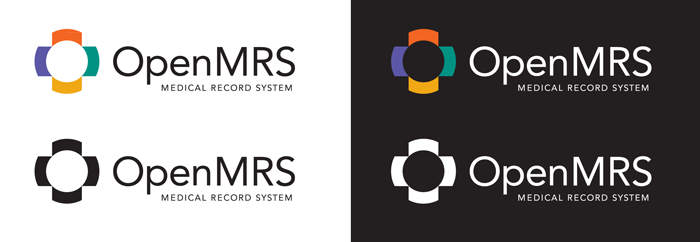
It may be necessary to display the logo in one color, e.g., to save on printing costs. If so, both the logo and wordmark should be in black or white, as appropriate.
When displayed over a dark background, the wordmark and tagline (if applicable) should be shown in white. The visual elements should remain in their standard colors.
One-color printing should be used in lieu of any two-color combination.
Size Constraints and Layout Restrictions
Although the logo should not be separated whenever possible, in certain instances size constraints make it impractical to display the entire logo. In this case, the cross may be displayed alone. This must only occur when the entire logo (including wordmark) has already been introduced to the viewer, or the viewer is otherwise already aware of the OpenMRS identity.
The "OpenMRS" wordmark should never be placed below the cross.
Other Visual Modifications Not Allowed
For a consistent appearance across all OpenMRS materials, the logo must not be visually modified in any way that changes the colors or shape of the logo. In very rare cases, such as the OpenMRS web site, the logo may be slightly modified with minor gradients, but this should only be used to integrate it with part of a larger graphic design. The logo should appear flat against the background and not be rendered with any "3-D" or "bevel" effects.
Nothing should ever be placed inside the cross icon.
Not for Use by Other Products
You may not use, include, or modify the OpenMRS logo icon (round "cross" graphic) or wordmark in any way to adapt it for use in any other project or product. If you are building a derivative work from/using OpenMRS, you may use the phrase "Powered by OpenMRS" or "Built on OpenMRS" (or an equivalent local translation) in conjunction with your product's own name or logo. If you display the OpenMRS logo with or near your own product's logo, you should be sure that the OpenMRS logo appears no larger than 25% the size of your product's main logo.
Colors
It is important to use the official colors when duplicating the logo. CMYK should be used for print materials, and RGB colors should be used for electronic materials.
Sample Color | CMYK | RGB | RGB (Web) |
|---|---|---|---|
| 0C 75M 100Y 0K | Red: 242 | #F26522 |
| 75C 75M 0Y 0K | Red: 91 | #5B57A6 |
| 0C 35M 100Y 5K | Red: 238 | #EEA616 |
| 90C 0M 50Y 20K | Red: 0 | #009384 |
| 0C 0M 0Y 100K | Red: 35 | #231F20 |
Downloads
Original Adobe Illustrator and PostScript files of the logo are available for download.
The main transparent logo is:
Questions
In case of any additional questions about logo usage, please contact community@openmrs.org.


